Goretti Marroquin
Boyton Health
Redesigned Boynton Health’s patient portal to streamline navigation, reduce language barriers, and support international students in confidently preparing for clinic visits.
.png)
Overview
International students at the University of Minnesota face several challenges managing their health—confusing appointment systems, unclear insurance policies, and a lack of culturally responsive support. These barriers often result in underutilized healthcare services and poorer health outcomes.
UX Research
UX Designer
My Role
5 weeks
Duration
Design process

Double Diamond design process
Research
We started the project by exploring existing research on international students’ healthcare experiences, patient portals, and barriers to care. Next, we conducted semi-structured interviews with international students at the University of Minnesota to learn about their decision-making, appointment booking process, and the challenges they face while using the portal.
“I’m completely unfamiliar with this country’s healthcare system. I didn’t know if I needed to see a primary care doctor before going to physical therapy.”
Key Pain-points Identified
We used open coding to analyze the interview transcripts and identify themes. This helped us narrow the scope of the redesign:
01
Difficulty selecting the correct department for care
02
Lack of guidance on required documents or steps before a visit
03
Uncertainty about insurance coverage and expected costs
04
Confusing language and long symptom lists in dropdown menus
05
Frequent redirection to call or visit in person after failed attempts online
Current website analysis


We analyzed the patient portal experience through the lens of human factors—considering sensory, cognitive, and emotional interactions—to better understand the challenges international students face.

* This analysis helped us identify key usability pain points from a human-centered perspective, guiding our design decisions in the next phase
Persona

Ideation / Prototyping
Based on our research insights, we redesigned key features of the Boynton Health Patient Portal to better support international students
Using co-design principles, we focused on ideas that would be clear, supportive, and culturally inclusive. We generated four distinct design concepts, each targeting a specific pain point
01
AI Chatbot for Appointment Scheduling
What it solves: Confusion over how to describe symptoms and select the correct department
How it works: The chatbot allows users to describe their symptoms in any language. It interprets their input and guides them through the appointment process—recommending departments, asking preferences (in-person or virtual), and presenting available slots
02
To-Do List with Medical Glossary
What it solves: Students often don’t know what to bring or what to expect before an appointment.
How it works: Once an appointment is confirmed, the portal auto-generates a personalized checklist. It includes:
-
Required documents (e.g., ID, insurance)
-
A glossary of medical terms to help students feel prepared
-
Optional custom tasks students can add themselves
03
Visual Map of Insurance Coverage
What it solves: Uncertainty around where to go and whether a visit is covered by insurance.
How it works: An interactive map shows clinic locations and highlights which services are covered under the student’s insurance plan. Users can explore recommended clinics based on their needs
04
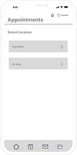
Mobile Version of the Portal
What it solves: Limited access to a desktop and need for on-the-go support.
How it works: A mobile-optimized version of the portal focuses on the most essential features—appointment scheduling, messaging providers, and viewing upcoming tasks.
OPTION 1


OPTION 2


OPTION 3


OPTION 4


Testing
We conducted usability testing sessions with both our original interview participants and design peers. During these sessions, users were asked to interact with the prototypes and reflect on their clarity, usefulness, and potential limitations.
We gathered common themes from their feedback and translated them into actionable design improvements for our final iteration.
Insight 01
Many users appreciated the to-do list feature, especially the reminders for documents and insurance. However, they expressed a desire for more flexibility, noting that their needs often went beyond the preset checklist
Design Impact
We enhanced the to-do list to include custom task creation, empowering students to personalize their preparation and feel more in control of their visit
Insight 02
When shown a mobile version of the portal, participants were quick to express that they didn’t want another app on their phones. Most felt that this feature should be accessible via the web browser
Design Impact
We prioritized optimizing the web-based portal over building a standalone app. This ensures that students can easily access their health information without the friction of installation, login setup, or storage concerns
Hi Fidelity Prototype


Final Thoughts
Redesigning the Boynton Health patient portal was an opportunity to support international students in navigating healthcare with more clarity and confidence. This project deepened my understanding of designing for diverse user needs and highlighted the value of combining research and testing in healthcare contexts.
In the future, I would like to explore the potential of a mobile app version. While our research showed that students didn’t initially want an app, I’m curious to see if offering it as an option could make accessing healthcare even easier for them.
