Goretti Marroquin
Spero
Redesigning Spero’s website to amplify the voices of grassroots organizations fighting human trafficking. A user-centered approach to connect donors with impactful, community-led solutions worldwide.

Overview
Many nonprofit websites fail to effectively communicate their mission or engage potential donors. In the case of Spero—a nonprofit that connects U.S. donors with trusted grassroots organizations fighting human trafficking—this challenge is especially critical.
Although Spero supports powerful international work, its website lacked clear visual hierarchy, emotional storytelling, and intuitive calls to action. As a result, key content such as partner stories, donation pathways, and impact metrics were difficult for users to find or connect with.
UX Research
UX Designer
My Role
7 weeks
Duration
Goal
Our goal was to redesign Spero’s website to better reflect its mission, inspire trust, and drive meaningful donor engagement.
This included:
- Enhancing content structure to prioritize clarity and readability
- Elevating the visibility of donation options and partner impact
- Creating an emotional connection through storytelling and accessible design
- Ensuring the site was visually engaging, responsive, and easy to navigate across devices
Design Process

Research
We kicked off the project by analyzing Spero’s current site to identify usability gaps and opportunities. Next, we conducted interviews with the Spero team to learn what they wanted from their site and what mattered most to them. We also interviewed potential users to understand their needs, expectations, and how they would engage with the site.
Current Website Evaluation


Evaluation Criteria
Shortcomings
-
UX Design best practices
-
Accessibility principles
-
Jakob Nielsen’s Heuristics
-
Nonprofit website design research
-
Lack of engaging visual hierarchy
-
Heavy reliance on text
-
Limited user interaction or calls to action
-
Missing storytelling or emotional appeal for donors
Observations
UX
-
Homepage lacks a clear value proposition or call to action for new visitors.
-
Heavy text blocks hinder readability and emotional connection.
UI
-
Minimalist aesthetic lacks contrast and clear hierarchy.
-
Team page builds trust but needs a more consistent layout.
Interview with Spero
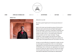
We interviewed Jonah Traaseth, the Executive Director of Spero, to better understand the organization’s needs and vision for the project. From this conversation, it became clear that the primary goal of the website is to expand Spero’s reach and drive donations, highlighting the need for a clear donation pathway and persuasive calls to action throughout the site. Jonah also expressed a strong interest in using more video content as a storytelling tool to communicate Spero’s impact and connect emotionally with visitors.
Interview with experience donors
We conducted user interviews with experienced donors to understand their motivations, expectations, and what builds trust when supporting nonprofit organizations. Many participants emphasized that trust and alignment with a nonprofit’s mission are critical in their decision to donate. Additionally, several interviewees shared that personal connections or past experiences with charitable giving often increase their engagement and willingness to contribute.
Affinity Diagram
To synthesize the insights gathered, we created an affinity diagram. This method allowed us to visually group related observations, behaviors, and quotes into emerging themes

Persona
John Colson
About
Goals
Frustration

45 years old
Financial Manager
Hard-working and dedicated contributor in his community. He prides himself on his philanthropic work through various causes and charities locally and internationally while keeping up with his busy work and personal life alongside his loving partner and child. Methodically organized, John would like to see quick results and honest feedback stemming from his support and donations
Find a new non-profit to support
Wants to make sure his money goes to a good cause
Lack of transparency
Misappropriation of funds
Ideation
After understanding user and stakeholder needs, we moved into ideation to explore ways to make Spero’s mission clear, build trust with visitors, and encourage donations. We sketched and mapped out ideas focusing on simplifying the donation flow, integrating storytelling, and creating a more engaging, accessible site experience.
Sitemap

Initial user flow for Spero was iterated
Low Fidelity Wireframes


For the prototype, our goal was to preserve Spero’s clean and minimal aesthetic while improving usability and engagement.
While the Spero team valued having a video on the homepage, our analysis showed that users often skipped it, missing critical information. To address this, we integrated the video as part of the content grid rather than the primary focal point. Additionally, we enhanced the homepage by introducing concise, impactful facts to immediately capture users' attention.
We also optimized the donation flow by reducing steps and improving clarity, creating a more seamless and intuitive giving experience.
Usability Testing
We conducted usability testing with participants to evaluate the clarity, readability, and navigation of our low-fidelity prototype
Insight 01
Users Felt Overwhelmed by Too Much Information Per Page
Approximately 65% of users in our usability testing expressed that many pages—especially the homepage—presented too much information at once. Users appreciated the inclusion of impact statistics, but they were reluctant to engage with large text blocks or dense content early in the experience
Design Impact
In response, we simplified the homepage layout to focus only on the most critical facts and emotional hooks, such as the mission statement and key statistics. Supporting content (e.g., founder’s story, partner details, how to get involved) was moved to secondary pages
Insight 02
More Information About Each Fundraising Event
During testing, users showed interest in learning more about individual fundraising events, but the existing layout only provided brief summaries with no option to explore further. This created frustration and limited engagement, as users couldn’t find details such as dates, locations, or how to participate
Design Impact
we redesigned the Fundraise section to give each event its own dedicated page. This allowed us to provide richer content—including full event descriptions, sign-up options, and shareable links—without overwhelming the main Fundraise page
.png)
.png)
Final Thoughts
Redesigning the Spero website allowed us to support a nonprofit’s mission by creating a clearer donation pathway and prioritizing storytelling that connects with visitors. This project taught me the importance of balancing organizational goals with user needs, especially when designing for nonprofits that rely on trust and emotional engagement to drive support. In the future, I would like to explore how video content and donor stories can be further integrated to build a deeper connection with potential donors and sustain engagement.

